Greetings All,
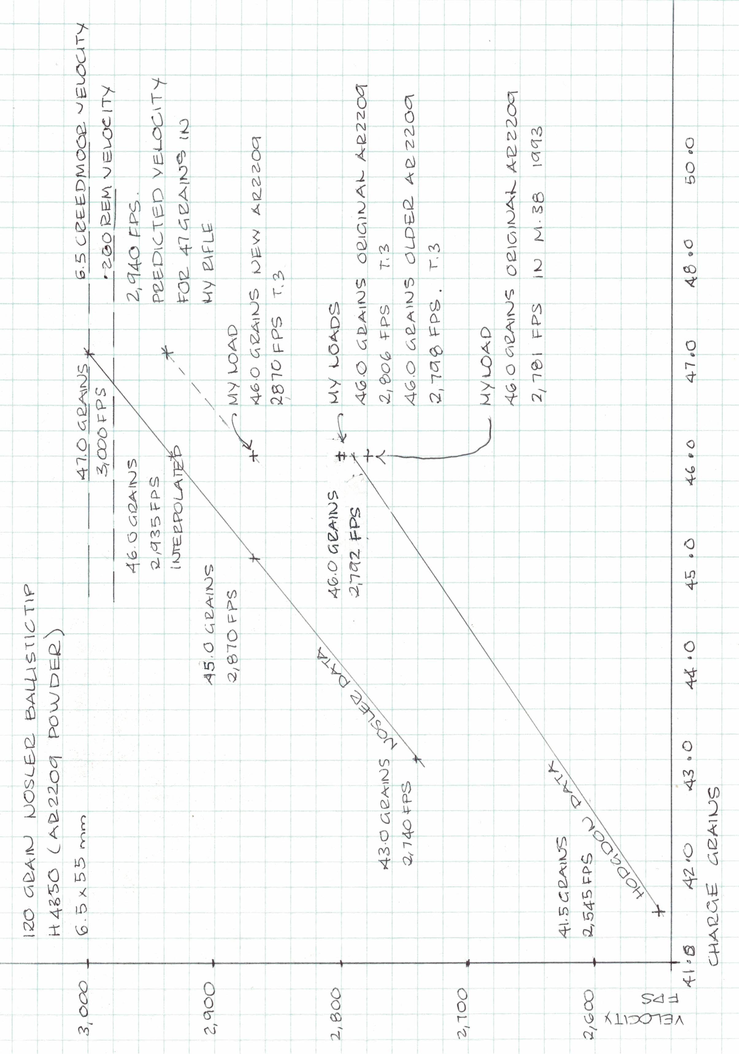
Here is something I have posted before that you might want to try on one of those wet days over the holidays when grumpiness levels are peaking. Draw a graph. I have long used graphs, like the one below, to make sense of handloading data.
I was trying to make sense of the variations between two sets of data which appeared to conflict. It is quite simple. Plot the data on graph paper with the powder charge on one axis and the velocity on the other. I just used some 5mm graph paper that was on my desk. The plots are usually in a line rather than a curve. The graph showed me two things. The first was that the Nosler data is loaded hotter than the Hodgdons which I expected. The second was that my later lot of AR2209 was significantly faster then the older lots I had on hand which I did not expect. You can see where I plotted the two old lots and the new. You can also use the graph to give you an approximate load to deliver your target velocity to save the endless working up in pixie pinches of powder. My recorded velocities in my T3 are lower than the Nosler data, even with the later powder, I suspect due to the shorter barrel and partly to a tighter Nosler test barrel.
The graphs are also useful for comparing data for the older cartridges like the .303 and .30-40 which is often varied. So if you are stuck at home over the hols, with rain drumming on the roof and a forecast of worse to come, graph some of your loads and data. Feel free to ask questions.
Regards Grandpamac.
Welcome guest, is this your first visit? Create Account now to join.
Welcome to the NZ Hunting and Shooting Forums.
Search Forums
User Tag List
+ Reply to Thread
Results 1 to 5 of 5
Hybrid View
-
22-12-2024, 01:40 PM #1Member

- Join Date
- Dec 2019
- Location
- Okawa Hawkes Bay
- Posts
- 3,178
Handloaders Sanity in the Holidays
-
22-12-2024, 02:26 PM #2Member

- Join Date
- Mar 2017
- Location
- Hamilton
- Posts
- 400
That is very cool!
-
22-12-2024, 02:35 PM #3Member

- Join Date
- Jul 2024
- Location
- Hurunui
- Posts
- 53
I currently write everything down in a note book, and then spend hours flicking back and forth to try and make sense of what I've achieved. Your graph makes much more sense and quicker to see where I would be heading. Thanks for making it simple.
-
22-12-2024, 02:41 PM #4
Xls or Libre sheets are both is great for graphs if your so inclined.
Hunt safe, look after the bush & plug more pests. The greatest invention in the history of man is beer.
https://youtu.be/2v3QrUvYj-Y
A bit more bang is better.
-
22-12-2024, 10:18 PM #5Member

- Join Date
- Dec 2022
- Location
- Whanganui
- Posts
- 1,364
Ah Rain, a rare commodity in Victoria at present. But luckily I have a new tractor to play on and just gonna use ppu ready made for the rabbits, and anything else the crosses my path.
Similar Threads
-
6.5x55 SE Sanity Check
By Magnetite in forum Reloading and BallisticsReplies: 37Last Post: 09-03-2025, 04:04 PM -
Good finish to the holidays
By Chur Bay in forum The MagazineReplies: 13Last Post: 17-11-2022, 05:28 PM -
Anyone in Aus want to save my sanity?
By Stocky in forum HuntingReplies: 13Last Post: 01-12-2018, 07:59 AM -
Fire arm storage over the holidays
By Blisters in forum Firearm SafetyReplies: 11Last Post: 29-12-2016, 05:50 PM
Tags for this Thread
Welcome to NZ Hunting and Shooting Forums! We see you're new here, or arn't logged in. Create an account, and Login for full access including our FREE BUY and SELL section Register NOW!!


 5Likes
 LinkBack URL
 About LinkBacks


 Reply With Quote


Bookmarks